
Your startup is getting traffic. People are clicking your ads, visiting your landing pages, and even spending time exploring your product. But despite all that activity, conversions remain disappointing.
If you’ve ever wondered, “Why is my website not converting?”, you’re not alone. The problem isn’t weak marketing or low traffic. It’s what happens after users arrive.
Table Of Contents
- The Real Problem: Traffic Isn’t Always the Issue
- The Hidden UX Problems Behind Low Conversions
- Why Speed and Mobile Experience Matter More Than Ever
- How Poor CTAs and User Friction Kill Conversions
- How Startups Can Improve Conversion Through Better UI/UX
- FAQs (Frequently Asked Questions)
- Why is my website not converting even with good traffic?
- Does UI/UX affect conversion rates?
- What are signs of poor website UX?
- Can better UX increase sales?
- How often should startups review UX?
- Final Thoughts
- About AVingenious
Why Is My Website Not Converting?
If your website isn’t converting, common reasons can be poor navigation, slow page speed, confusing calls-to-action, weak mobile experience, and friction in forms or checkout flows. Even small UI/UX issues can interrupt the user journey and quietly reduce conversions.
This is what makes poor UI/UX so dangerous: it rarely fails loudly. Users usually don’t tell you what went wrong. They simply hesitate, get frustrated, or leave.
In many cases, conversion problems are less about attracting more visitors and more about removing the friction that prevents existing visitors from taking action.
The Real Problem: Traffic Isn’t Always the Issue
When conversions drop, most startup teams look in the obvious places first: ad performance, SEO rankings, or lead quality. The assumption is simple. If more people visit the website, more people should convert.
On paper, that makes sense. In reality, it often doesn’t.
A growing number of startups discover that traffic isn’t the real bottleneck. The real issue lies in the experience users have once they arrive. A beautifully designed ad campaign can drive thousands of visitors, but if the product page feels confusing, overwhelming, or difficult to navigate, those visitors rarely become customers.
This is where many teams misdiagnose the problem. They keep investing in acquisition while ignoring conversion friction.
Poor UI/UX rarely appears in analytics dashboards as an obvious error. It hides inside subtle user behavior: hesitation before clicking, abandoned forms, incomplete sign-ups, or silent drop-offs during checkout.
More traffic can increase visibility, but it doesn’t automatically improve conversions. If the user journey feels difficult, every additional visitor simply meets the same friction.
Driving traffic is only half the equation. Learn how strategic digital marketing works best when paired with conversion-focused user experiences. .
The Hidden UX Problems Behind Low Conversions
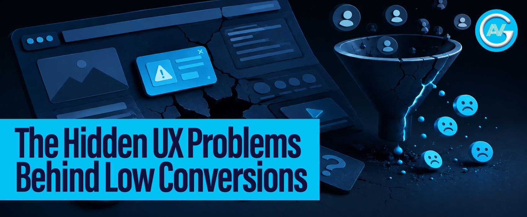
If you’re wondering why your website is not converting, more traffic may not be the answer. Many startups assume low conversions mean they need more traffic. So they invest heavily in ads, SEO, and acquisition campaigns. But more traffic does not automatically mean more customers.
When visitors land on your website, they make judgments within seconds. Can they understand what you offer? Is the navigation intuitive? Is the next step obvious?
Research shows users form a first impression of a website in as little as 50 milliseconds. That means visitors often begin judging credibility, design quality, and trustworthiness before they consciously engage with your content.
When the experience feels cluttered or confusing, cognitive overload kicks in. Users are forced to think harder than they should, and every extra mental effort increases the chance of drop-off.
Research from Nielsen Norman Group consistently shows that reducing cognitive friction improves usability and decision-making. Simply put, visitors should focus on your product, not on figuring out your interface.
Why Speed and Mobile Experience Matter More Than Ever
Speed is no longer a luxury feature; it directly impacts conversions.
According to Google PageSpeed Insights, even small delays in load time can significantly increase bounce rates. Modern users expect near-instant interactions, especially on mobile.
This matters because mobile traffic now dominates across many industries. A desktop experience that looks polished can still fail badly on smaller screens.
Buttons that are hard to tap, text that feels cramped, broken layouts, and slow-loading assets create friction fast. For startups, this is especially dangerous because first impressions often determine whether a visitor becomes a lead, or disappears forever.
A slow, poorly optimized mobile experience quietly communicates something users notice immediately: lack of trust. Explore how performance-focused web development can improve speed, usability, and growth.
How Poor CTAs and User Friction Kill Conversions
Even when users stay, conversion can still fail at the decision stage.
One of the most common mistakes startups make is assuming users will “figure out” what to do next. They won’t. A weak CTA like Submit or Learn More rarely creates urgency or clarity. Worse, offering too many options can trigger decision paralysis.
Forms create another major conversion bottleneck. Asking for unnecessary details, company size, phone number, industry, budget, before establishing trust often drives users away.
The same applies to sign-up and checkout flows. Every extra field, extra click, or forced account creation adds friction.
Conversion optimization is often less about persuasion and more about removing obstacles.
How Startups Can Improve Conversion Through Better UI/UX
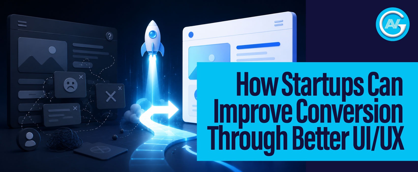
Improving conversions doesn’t always require a complete redesign. Often, small UX improvements create meaningful gains. Start by auditing your user journey. Look at where users hesitate, where sessions drop, and where forms are abandoned. Tools like heatmaps, session recordings, and funnel analytics can reveal patterns traditional dashboards miss.
Next, simplify aggressively.
- Reduce navigation clutter.
- Improve page hierarchy.
- Make CTAs clearer and more action-oriented.
- Remove anything that doesn’t help users move forward.
- Most importantly, treat UX as an ongoing optimization process, not a one-time design project.
- The best-performing startups continuously test, learn, and iterate.
Curious how AI can actually help your business grow? Exploring the right digital strategy can make all the difference.
Frequently Asked Questions
Good traffic does not guarantee conversions. If visitors are coming but not taking action, the problem often lies in poor UI/UX, unclear messaging, weak CTAs, slow loading speeds, or friction in the user journey. Even interested users may leave if the experience feels confusing or difficult.
Yes. Poor UI/UX increases friction, confusion, and cognitive effort, making users less likely to complete desired actions.
Common signs include high bounce rates, abandoned forms, poor mobile engagement, low session duration, and weak conversion rates.
Absolutely. Better UX improves trust, usability, and decision confidence, which can directly improve conversions and revenue.
Startups should review UX regularly, especially after launching new features, redesigning pages, or noticing performance drops.
Final Thoughts
Poor UI/UX rarely announces itself as the problem. It quietly drains conversions through friction, confusion, and missed opportunities. Before spending more on traffic, ask a better question: are visitors leaving because they aren’t interested, or because the experience is getting in their way?
About AVingenious
AVingenious is a software development company in Allahabad/Prayagraj helping startups grow through strategic web development, user-focused design, and performance-driven digital marketing. By combining strong digital experiences with smart growth strategies, we help businesses attract the right audience and turn more visitors into customers. Learn more about AVingenious and our services on our website.